Fully Customized, Responsive Menu
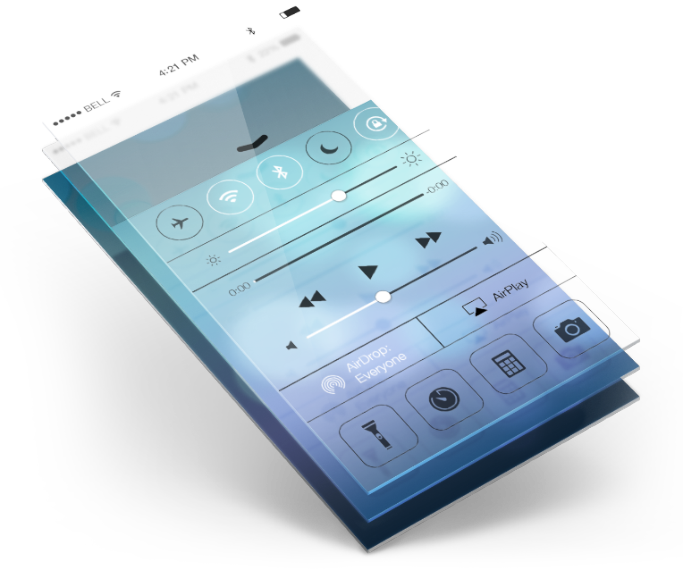
We put a custom-made JavaScript behind the front page that makes the phones change their screens. The Uber menu plugin that was used makes the buttons change size as well as retain their functionality on the smaller screens.
It is just enough to capture a prospective clients’ eye while still appearing professionally polished.
Flexible
We made sure that the new Prodigy website fit all screen sizes. This ensures that their website is found by more people who are looking for their services!
Artistically Pleasing
Who says that a website has to be boring? Certainly not us! The new Prodigy Mobility Website is simple, useful and delightful to look at.
Functional
Functionality is at the very core of what we do. It simply has to work, properly. Everything on the Prodigy site, does exactly what it is supposed to do.
User Friendly
A prospective client will only stay on your new website if they like what they see. Keeping it simple and crystal clear translates into increasing your bottom line.